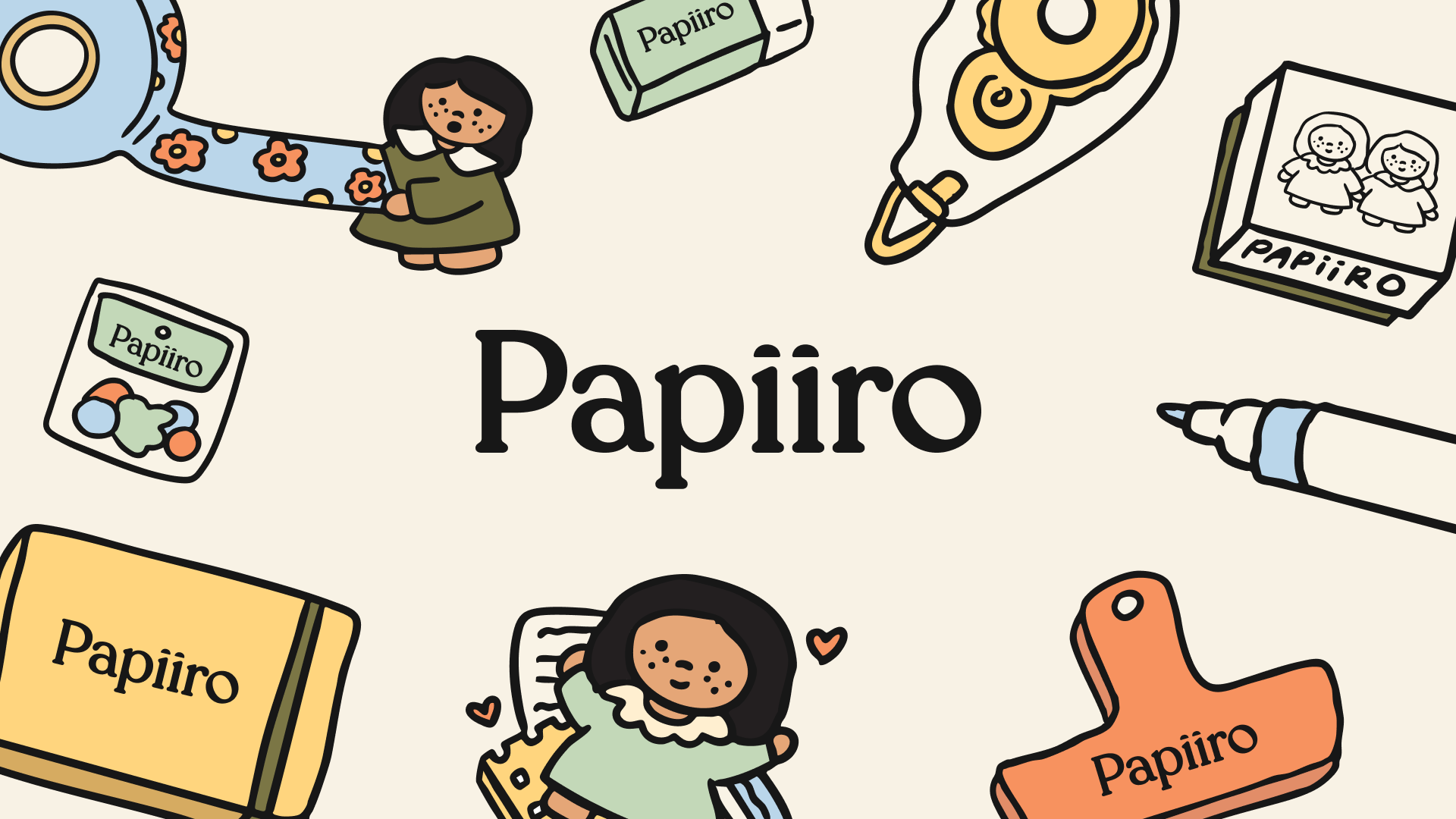
Papiiro
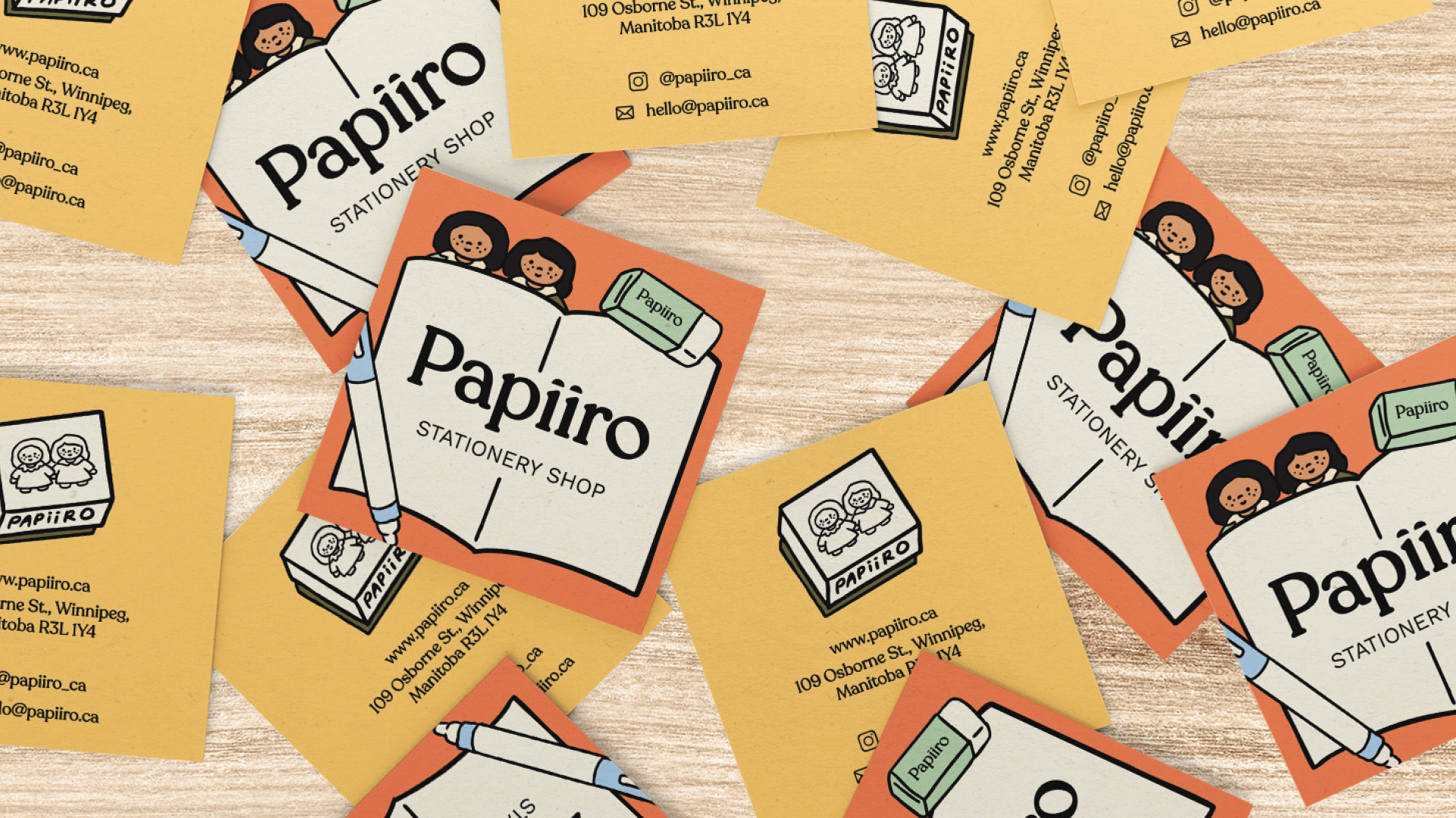
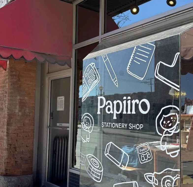
Papiiro is a stationery brand built around the idea that creativity often starts with a blank page. The visual identity combines playful typography, bold colours, and expressive graphic elements to create a brand that feels approachable, inspiring, and full of personality.
YEAR
2025
CLIENT
Papiiro
SCOPE
Brand Identity
The Challenge
The stationery market is often split between highly minimal brands and products aimed at children. The challenge was to create a brand that felt playful and expressive while remaining versatile enough to appeal to students, creatives, and stationery enthusiasts alike.

The Solution
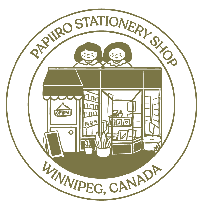
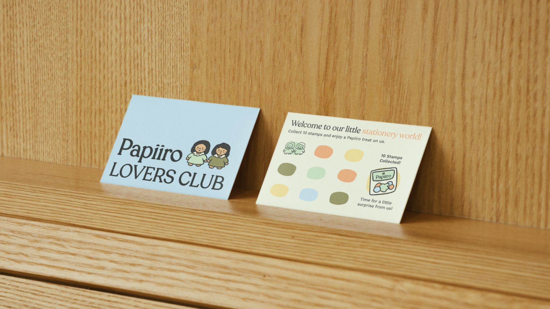
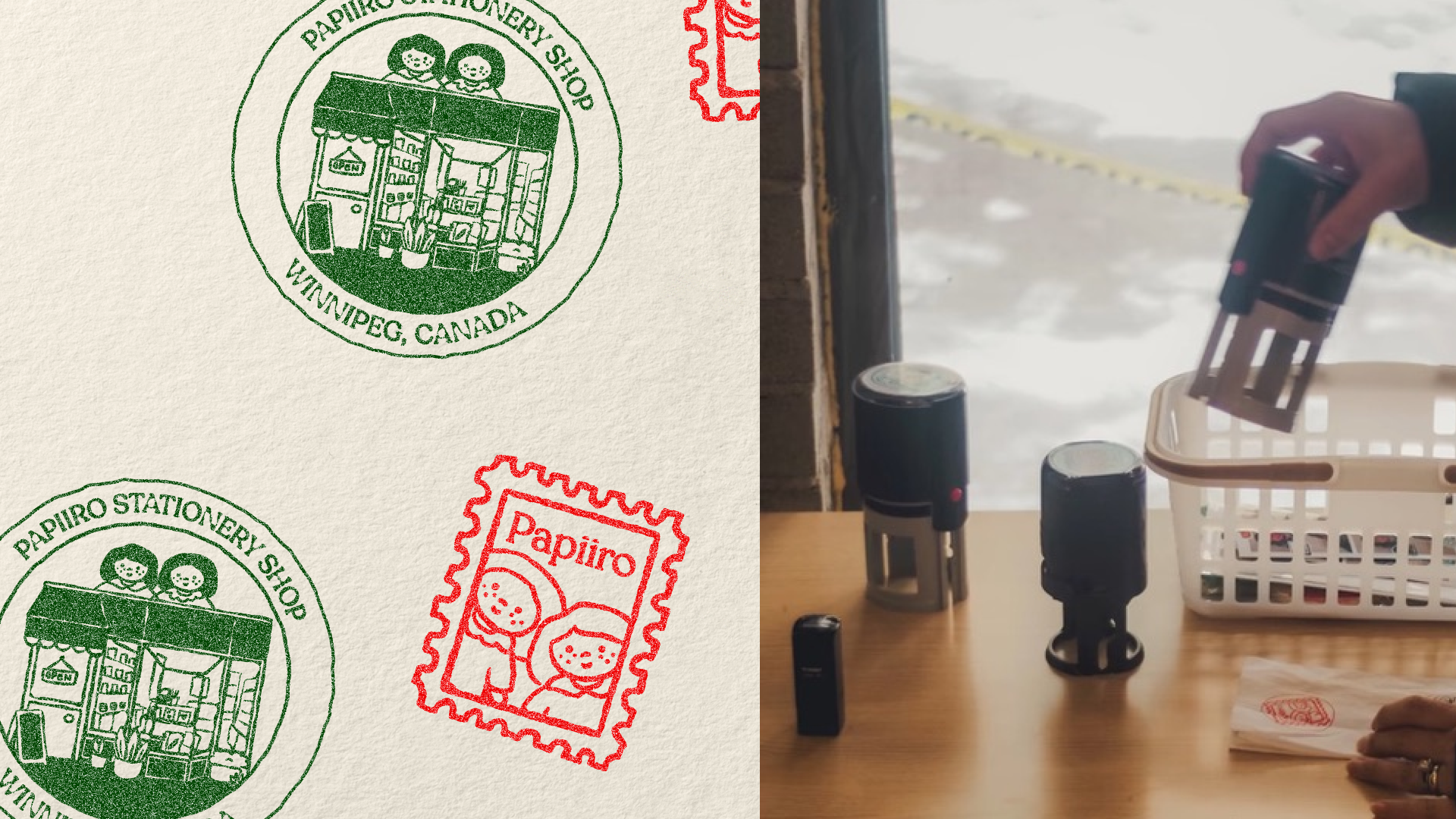
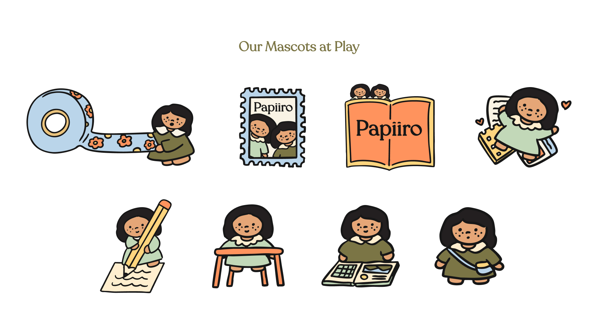
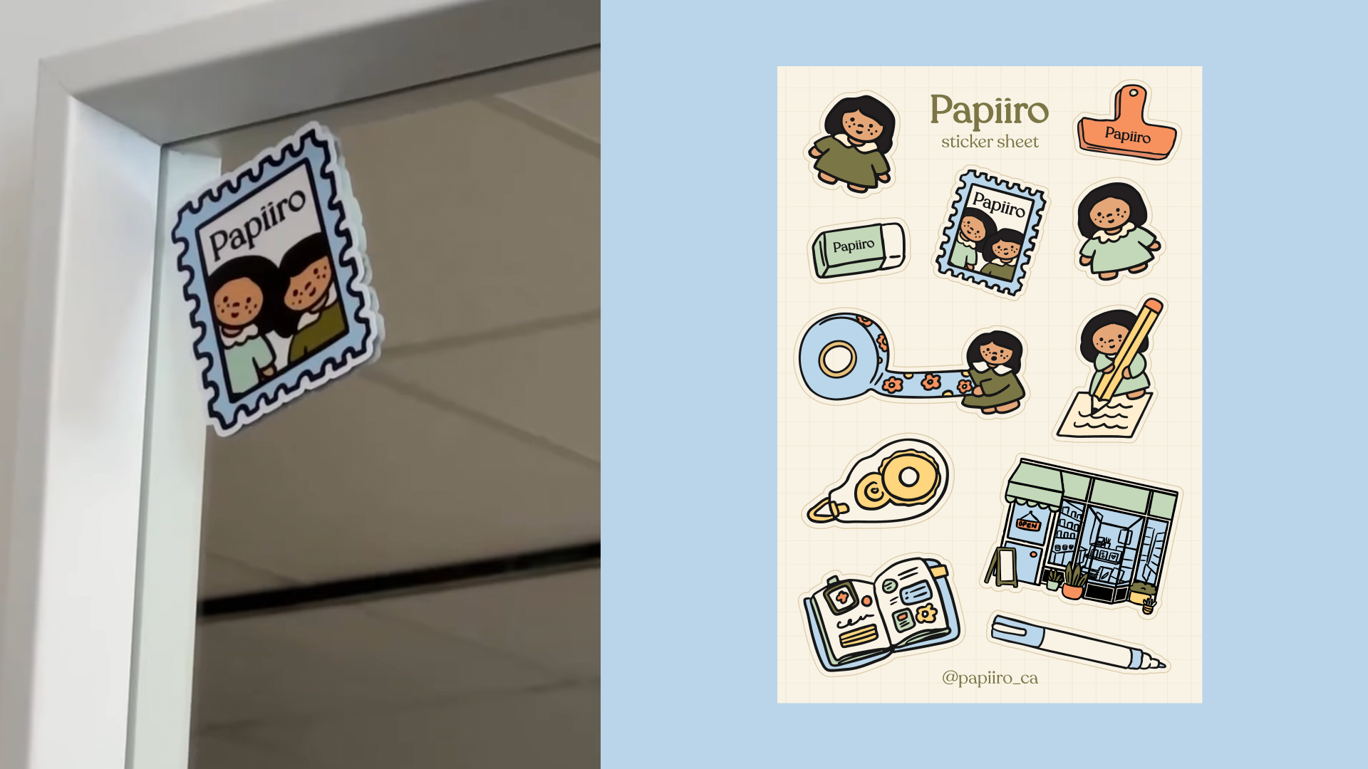
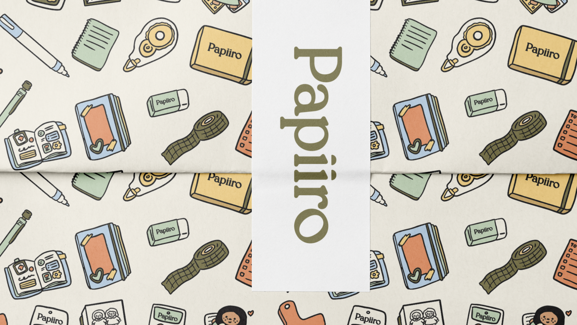
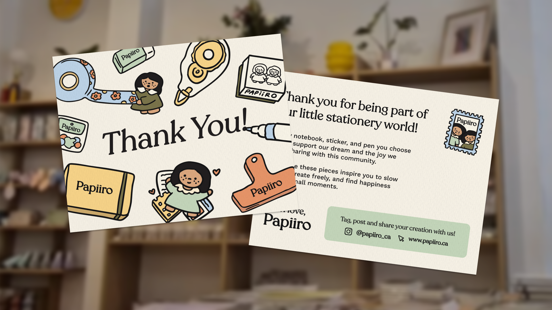
The identity combines friendly typography, a warm colour palette, and a cast of playful characters to create a brand that feels welcoming and full of personality. Together, these elements form a flexible visual system that can extend across packaging, retail environments, stickers, stamps, and future product collections.

Creative Direction
At the heart of Papiiro is the idea that creativity doesn't need to be perfect. The visual language embraces curiosity, experimentation, and ideas in progress, celebrating the small moments that often lead to something bigger.


Working with Grace on our re-brand was an absolute dream. From the very beginning, she was incredibly easy to work with and remained completely open to our suggestions, making the entire process feel like a true partnership. Grace didn’t just create a logo; she brought our vision to life in a way that exceeded every expectation we had. She managed to capture the true essence and heart of our shop. Our brand is now beautifully cohesive, with branding that resonate perfectly with our local stationery community. We couldn’t be happier!
—Caryl from Papiiro